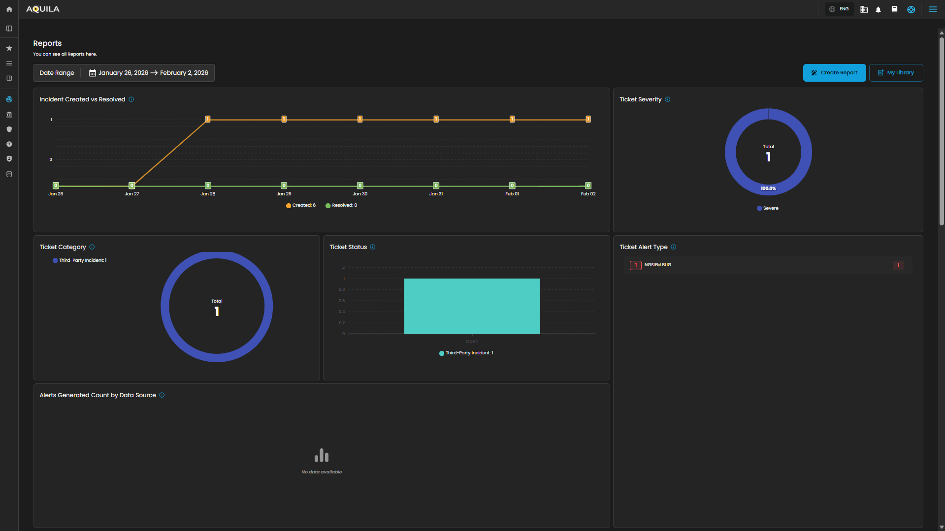
CyTech AQUILA - Cyber Incident Management (CIM): Reports
The Reports Dashboard provides a centralized interface for monitoring, analyzing, and reviewing security tickets and alert activity within a defined date range. It consolidates data into visual charts and categorized metrics, enabling analysts to evaluate incident trends, ticket statuses, and alert sources for more effective decision-making.
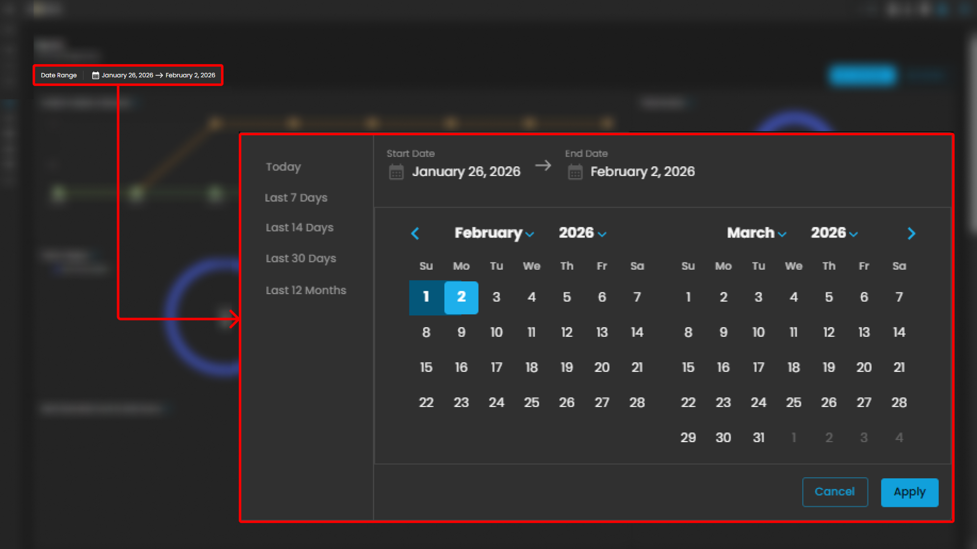
Date Range Selector
Defines the reporting period for all displayed metrics.
Functionality:
-
When the user clicks on the Date Range field, a calendar pop-up appears.
-
The calendar allows analysts to specify both Start Date and End Date.
-
Predefined quick ranges are available for convenience:
-
Today
-
Last 7 Days
-
Last 14 Days
-
Last 30 Days
-
Last 12 Months
-
-
Users can also select custom ranges directly from the calendar by clicking the desired start and end dates.
-
Once the range is selected, the analyst can either:
-
Apply → Confirm and refresh dashboard data.
-
Cancel → Exit without changes.
-
Operational Insight:
-
Enables analysts to generate time-bound reports for specific investigations (e.g., reviewing alerts during a known phishing campaign window).
-
Quick ranges are useful for standard reporting periods (weekly, monthly, quarterly).
-
Custom ranges support flexibility when investigating incidents that cross standard reporting boundaries.
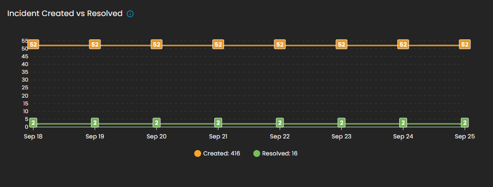
Incident Created vs Resolved
This graph shows the number of incidents created vs. resolved, depending on the selected date timeline.
-
Visualization: Line chart with two metrics:
-
Created (orange line): Total number of incidents raised during the reporting period.
-
Resolved (green line): Total number of incidents successfully closed.
-
-
Purpose: Enables analysts to assess case resolution efficiency compared to incident creation rates.
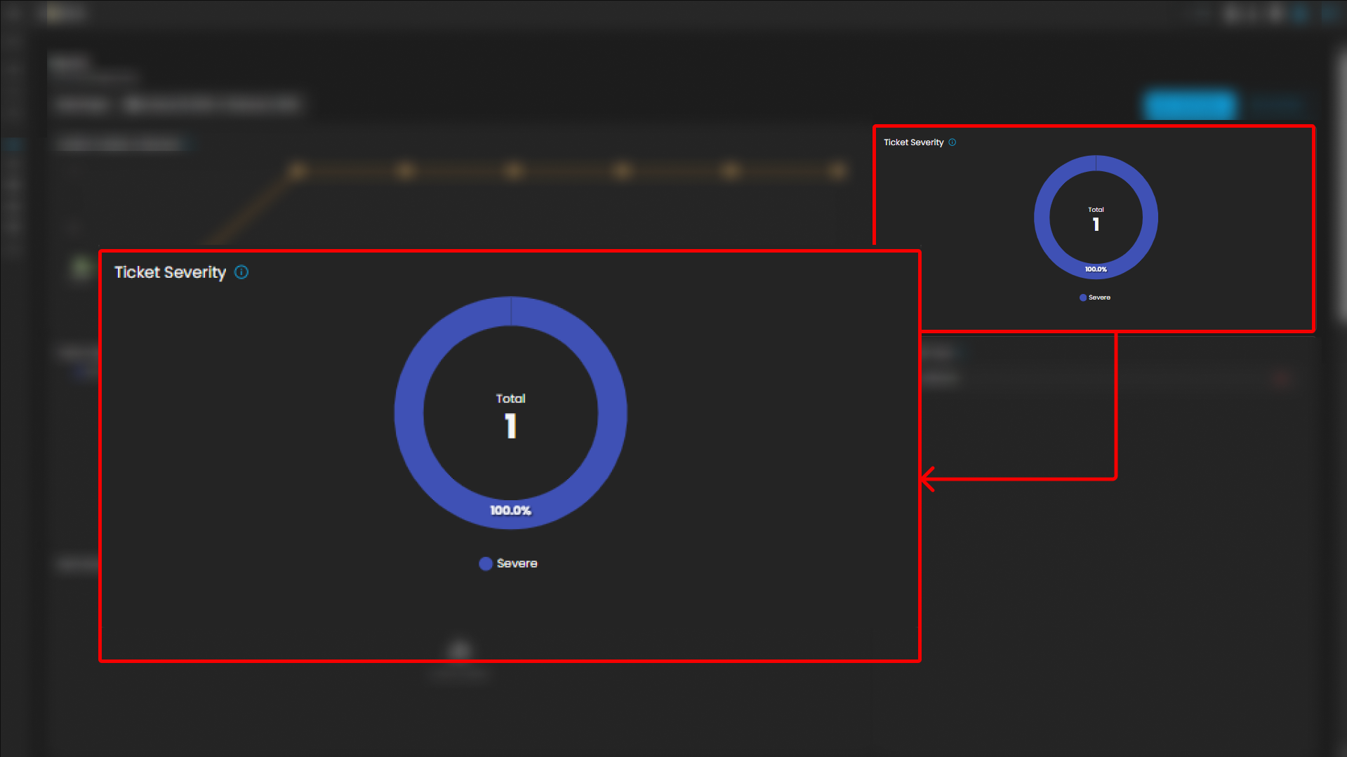
Ticket Severity
This graph displays the distribution of tickets by severity level.
-
Visualization: Donut chart with severity distribution.
-
Categories Displayed:
-
Guarded
-
Low
-
-
Purpose: Summarizes the severity levels of tickets to help analysts prioritize workload.
-
Operational Insight: A higher proportion of “Guarded” severity tickets may signal elevated but manageable risks, requiring proactive monitoring.
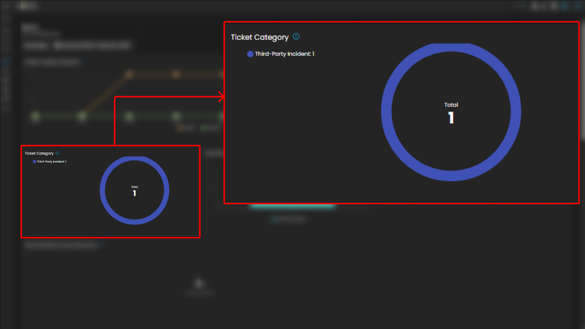
Ticket Category
Breaks down tickets based on their assigned category.
-
Visualization: Donut chart displaying distribution across categories.
-
Categories:
-
General
-
Credential Compromise
-
Malicious Email
-
Data Breach
-
Malware
-
-
Purpose: Provides analysts with visibility into the types of threats most frequently encountered.
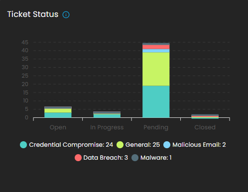
Ticket Status
This graph visualizes the current status of tickets to track resolution progress.
-
Visualization: Bar chart of ticket states.
-
Statuses Monitored:
-
Open
-
Pending
-
In Progress
-
Closed
-
-
Purpose: Tracks current case lifecycles, supporting workload balancing and resolution monitoring.
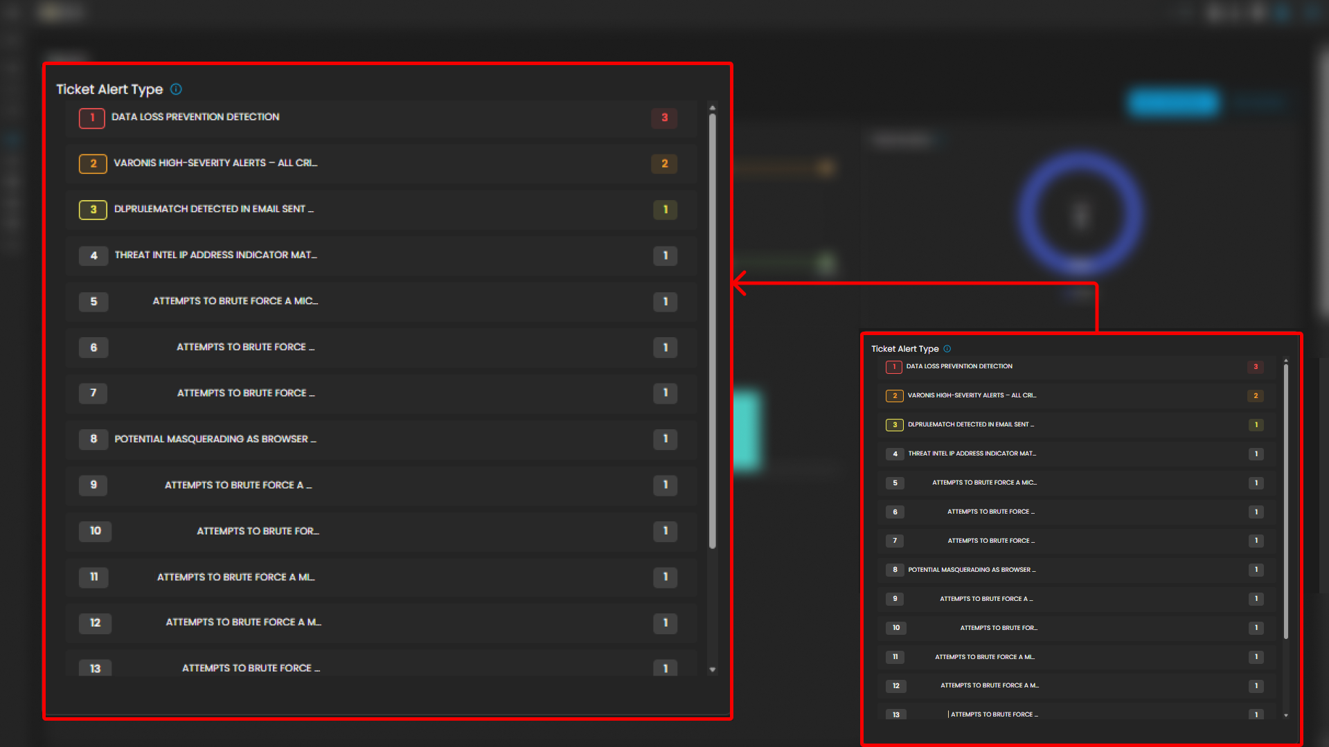
Ticket Alert Type
Provides a categorized breakdown of security alerts raised within the system. This helps analysts quickly identify the most frequent or severe types of alerts for prioritization and incident response. The feature also groups tickets by alert type and sorts them based on count, enabling analysts to focus on the most prevalent threats first.
Functionality
-
Each alert type is listed in descending order of volume.
-
A numerical badge beside each type shows the number of tickets generated.
Analyst Use Case
-
Prioritization: Analysts can quickly spot which alert categories are most frequent and critical.
-
Trend Identification: Helps SOC teams track recurring threats, such as repeated port scan attempts or ongoing phishing campaigns.
-
Investigation Focus: Guides where resources should be allocated for further log analysis and incident response.
-
Escalation Decisioning: High-volume or high-severity alert types can be escalated to Tier 2 or Tier 3 SOC analysts.
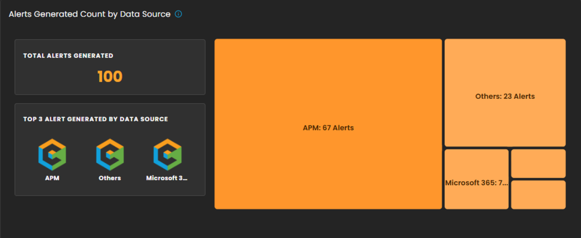
Alerts Generated Count by Data Source
This section provides a breakdown of security alerts based on their originating data sources. It enables analysts to identify which systems or platforms are contributing the highest number of alerts, supporting more targeted investigation and resource allocation.
Components
-
Total Alerts Generated
Displays the overall count of alerts detected within the selected date range. In the example shown, a total of 100 alerts were generated. -
Top 3 Alert Sources
Highlights the three primary data sources that generated the most alerts, allowing analysts to quickly focus on the most active or risky environments. -
Treemap Visualization
Graphically represents the distribution of alerts by data source. Each block corresponds to a data source, with the block size proportional to the alert count.-
Example: APM generated the highest number of alerts (67).
-
Others contributed 23 alerts.
-
Additional sources, including Microsoft 365, Endpoint, and Defender, are shown with smaller proportional segments.
-
Analyst Use Case
-
Prioritize monitoring efforts on high-volume sources such as APM.
-
Identify unusual spikes in alerts from less active sources.
-
Allocate investigative resources efficiently across multiple platforms.
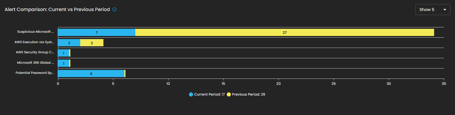
Alert Comparison: Current vs Previous Period
This section provides a comparative analysis of alerts generated during the current reporting period versus the previous period. The comparison highlights change in alert volume for specific alert types, helping analysts identify trends, anomalies, or shifts in the security landscape.
Components
- Bar Chart Visualization
- Each bar represents a specific alert type, segmented into two colors:
- Blue: Alerts generated in the current period.
- Yellow: Alerts generated in the previous period.
- The length of the segments reflects the alert count, allowing quick visual identification of increases or decreases.
- Each bar represents a specific alert type, segmented into two colors:
Analyst Use Case
- Identify reductions in recurring alerts, which may indicate resolved issues or improved security controls.
- Detect emerging threats when new alert types appear or when their frequency increases in the current period.
- Support trend reporting by comparing shifts in alert patterns over time, enabling better resource planning and proactive defense measures.
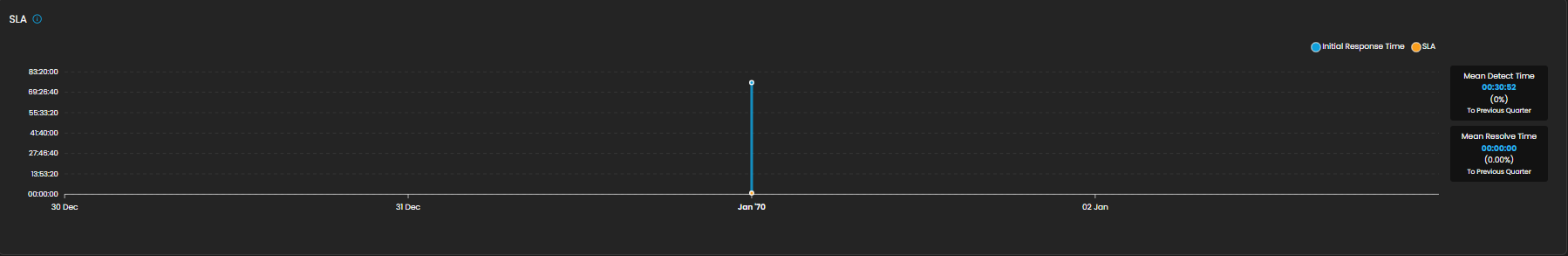
SLA
Displays Service Level Agreement (SLA) compliance, focusing on key performance metrics such as incident detection time and resolution time. This allows analysts and SOC teams to measure operational efficiency against defined service targets. The absence of data in the graph indicates that no incidents were recorded during the selected time period.
Components
- Graph View
- Timeline chart representing SLA performance over a defined period.
- Tracks detection and resolution trends for visibility into time-based compliance.
- Metrics Panel (Right Side)
- Mean Detect Time:
- Current Value: 01:11:56
- Change Compared to Previous Quarter: 0%
- Mean Resolve Time:
- Current Value: 00:00:00
- Change Compared to Previous Quarter: 0%
- Mean Detect Time:
Analyst Use Case
- Monitor SLA adherence to ensure timely detection and resolution of incidents.
- Identify bottlenecks in the detection-to-resolution cycle.
- Provide operational reporting to stakeholders on SOC performance.
- Ensure compliance with contractual or organizational SLA requirements.
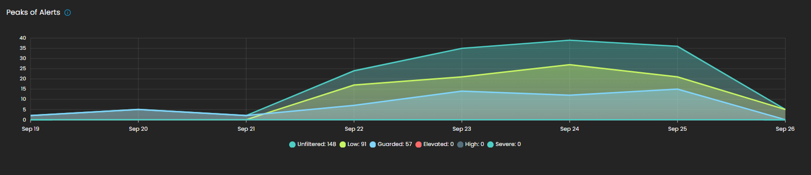
Peaks of Alerts
This visualization highlights time periods with the highest security alert activity. It provides analysts with a temporal view of alert distribution, making it easier to detect spikes, recurring trends, or unusual increases in activity. Alerts are categorized by severity levels such as Unfiltered, Low, Guarded, Elevated, High, and Severe, with corresponding counts shown for each.
By tracking alert peaks over time, this section helps security teams identify periods of heightened risk, allocate resources effectively, and prioritize investigation efforts.
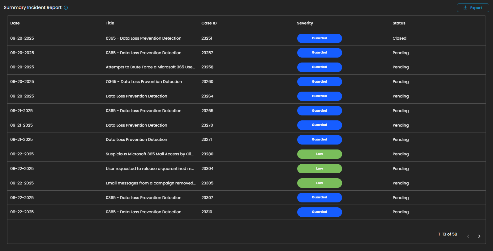
Summary Incident Report
This section displays a detailed list of incidents recorded within the selected date range. Each entry includes the date of occurrence, incident title, case ID, severity level, and current status (e.g., Pending or Closed). Incidents are categorized and color-coded by severity, allowing analysts to quickly assess their criticality and prioritize response efforts.
The report also supports export functionality, enabling users to generate and share incident data for further analysis, auditing, or compliance purposes.
This structured summary ensures that all incidents are systematically tracked and monitored, providing visibility into both ongoing and resolved security events.
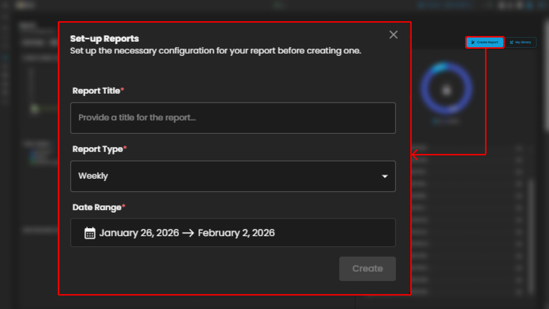
Create Report and My Library
The Reports module provides users with the ability to generate and manage analytical outputs for security incidents and operational performance. Within this module, two key functions are available:
-
Create Report
The Create Report function allows users to generate customized reports based on selected parameters such as date range, ticket severity, incident category, or status. This feature is designed to provide flexibility in reporting, enabling analysts and stakeholders to extract meaningful insights tailored to their specific needs.
-
My Library
The My Library function serves as a centralized repository where previously generated or saved reports are stored. Users can easily access, review, and manage their collection of reports, ensuring quick retrieval of historical data and consistent tracking of incident trends over time.
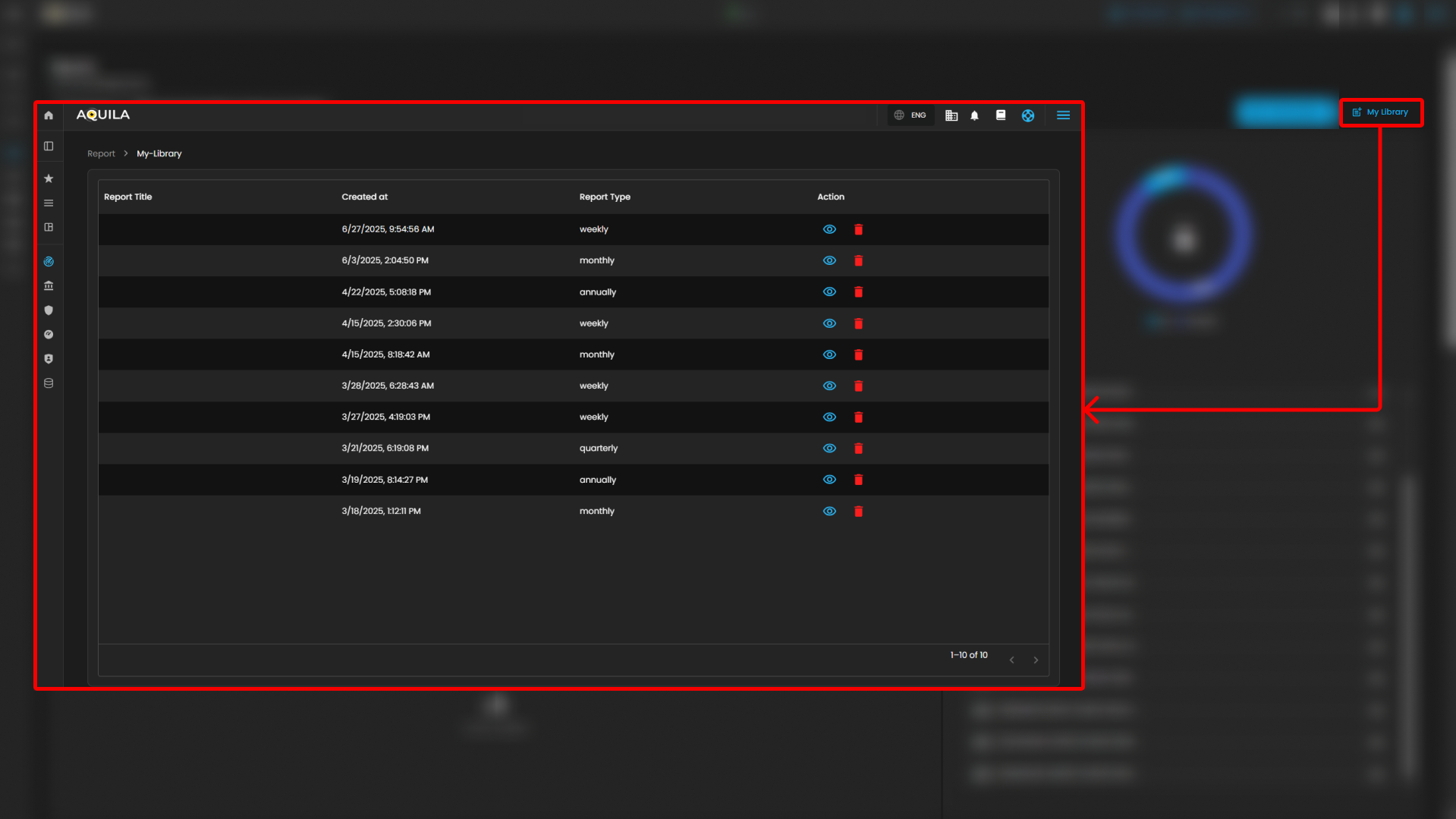
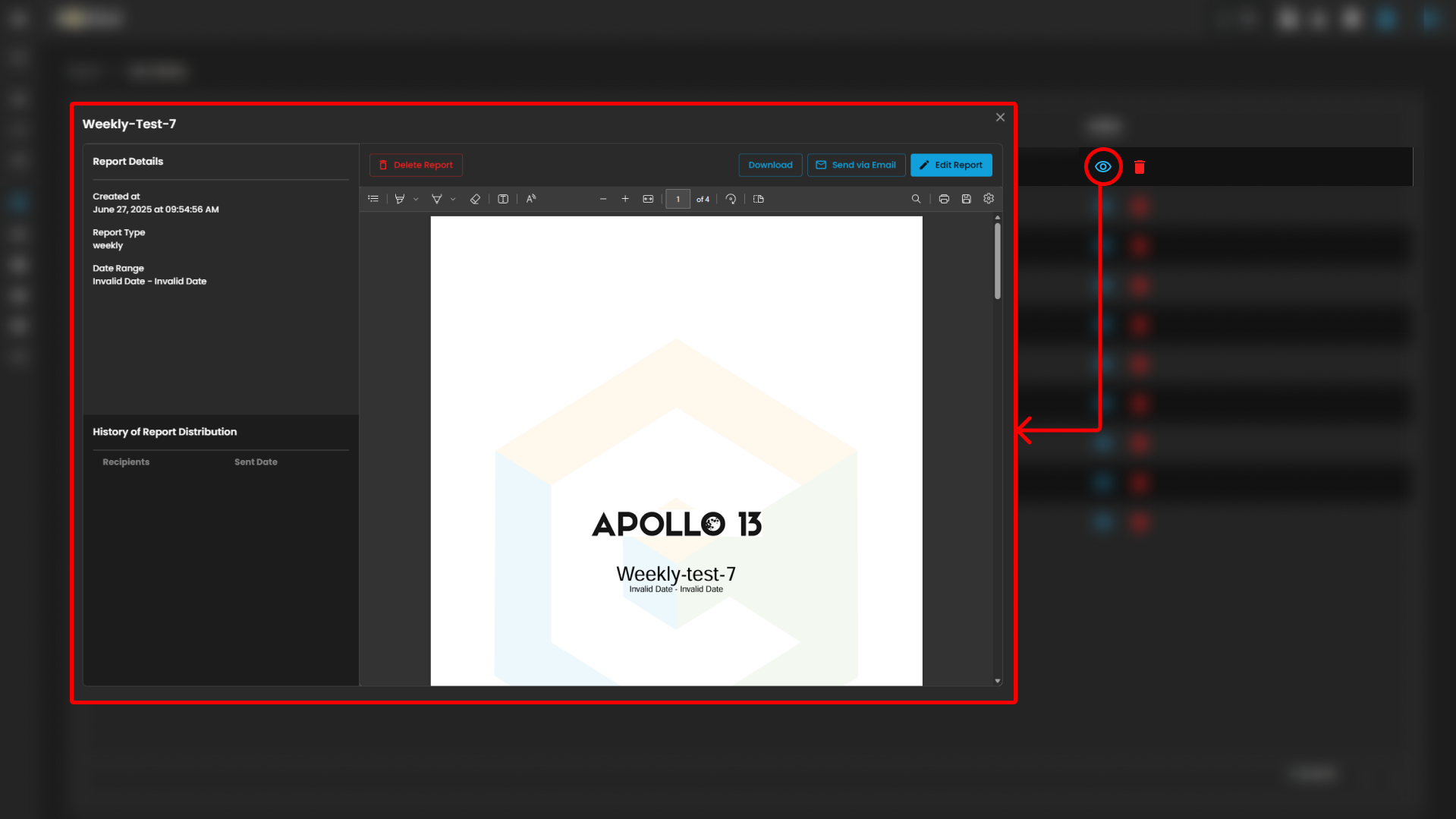
Users can also see more information about the report by pressing the eye icon. In this section, they can "edit the report" or "download" it by pressing the button above. The users can also send it "via email" or "delete" the report.
Together, these functions provide both the flexibility to create new reports and the convenience of accessing saved outputs, supporting continuous monitoring, analysis, and decision-making.
Please refer to the document from the previous sub-module: CyTech AQUILA - Cyber Incident Management (CIM): Data Explorer
Please refer to the document for the next sub-module:
If you need further assistance, kindly contact our support at support@cytechint.com for prompt assistance and guidance.